
 |
| Image from Understanding Graphics |
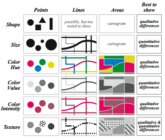
I once met Ben Fry, who if you don't know is the co-creator of the Processing programming language, and (also) made a name for himself doing some gorgeous visualizations for SEED magazine. I had just seen a fantastic design of his, and asked him how he went about choosing its colors and fonts. He gave me some advice I still follow today: start with black helvetica and go from there.
As well as this advice has served me, I feel ready to move into serif fonts and at least dual-colored bar charts. So lately I've enjoyed reading the blog posts from Shawn Allen's Data Visualization Course. He starts with a history of data visualization (remember Florence Nightingale?) and builds up from there. It's excellent and I highly recommend checking it out.
No comments:
Post a Comment